
Brand Strategy • Logo Design • Style Guide • Illustration
Cineplex Entertainment Rebrand — Brand Identity & Visual System
This project is a full brand reimagining of Cineplex Entertainment, Canada’s leading movie theatre and entertainment company. The goal of the redesign was to modernize Cineplex’s visual identity while reinforcing its core mission: delivering the magic of the movie-going experience through film, food, arcades, and immersive entertainment.
The rebrand introduces a bold new logo system, updated typography, refined colour palette, illustration guidelines, and a complete brand style guide to ensure consistency across all platforms.

Although Cineplex is one of Canada’s most recognizable entertainment brands, its existing identity felt visually minimal and disconnected from the emotional experience of cinema. The previous logo did not clearly communicate the company’s role in film, storytelling, and entertainment.
Brand Mascot — “Poppy”
As part of the rebrand, I introduced a new mascot named Poppy, a lovable popcorn character designed to add warmth, personality, and approachability to the Cineplex brand. Poppy represents the joy and excitement of the movie-going experience and helps position Cineplex as a family-friendly entertainment destination while still appealing to adult audiences.

Brand Strategy
The rebrand is built around the idea of Hollywood magic and red carpet glamour — turning every visit to Cineplex into a special event.
The visual direction draws from:
- Red carpet premieres
- Film reels and projectors
- Classic Hollywood iconography
- Theatre spotlights
- Cinematic staging
The goal was to make Cineplex feel less like a corporate brand and more like a destination for unforgettable experiences.

Cineplex logos throughout the years
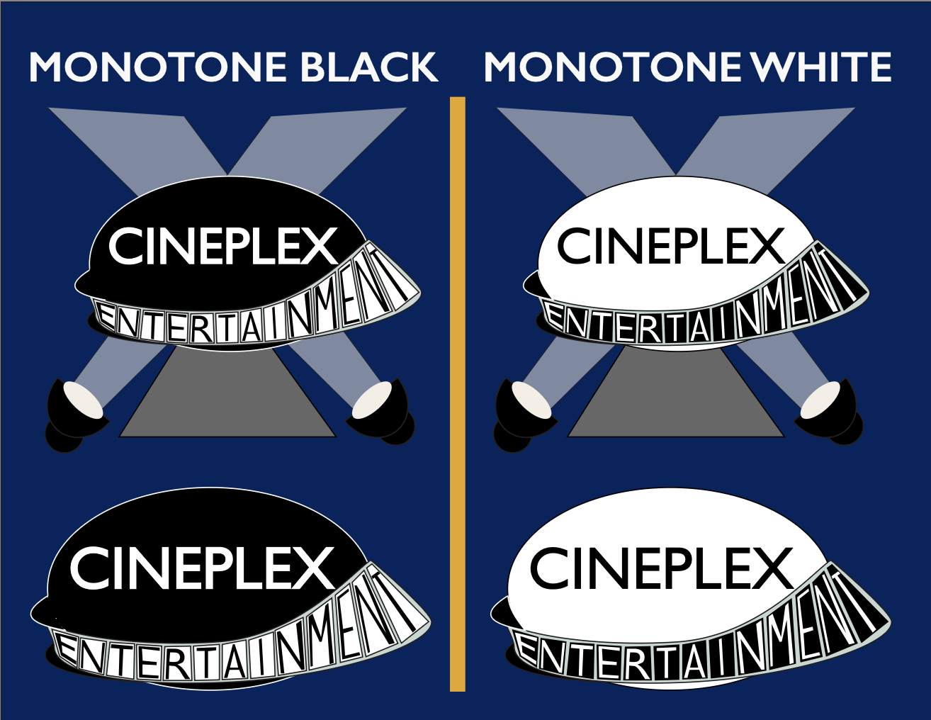
The new Cineplex logo combines two powerful cinematic symbols:
Film reels — representing storytelling, cinema, and motion Red carpet — representing Hollywood glamour, premieres, and excitement
Logo Concept

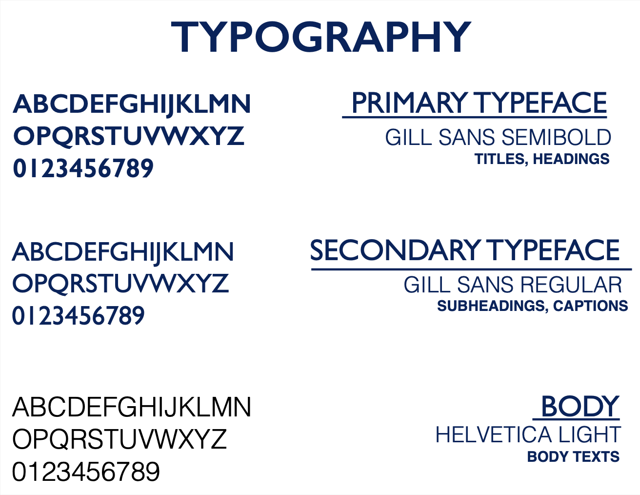
The typography system balances familiarity with modern clarity. This combination maintains Cineplex’s existing typographic identity while refining it for a more contemporary look.
Typography System
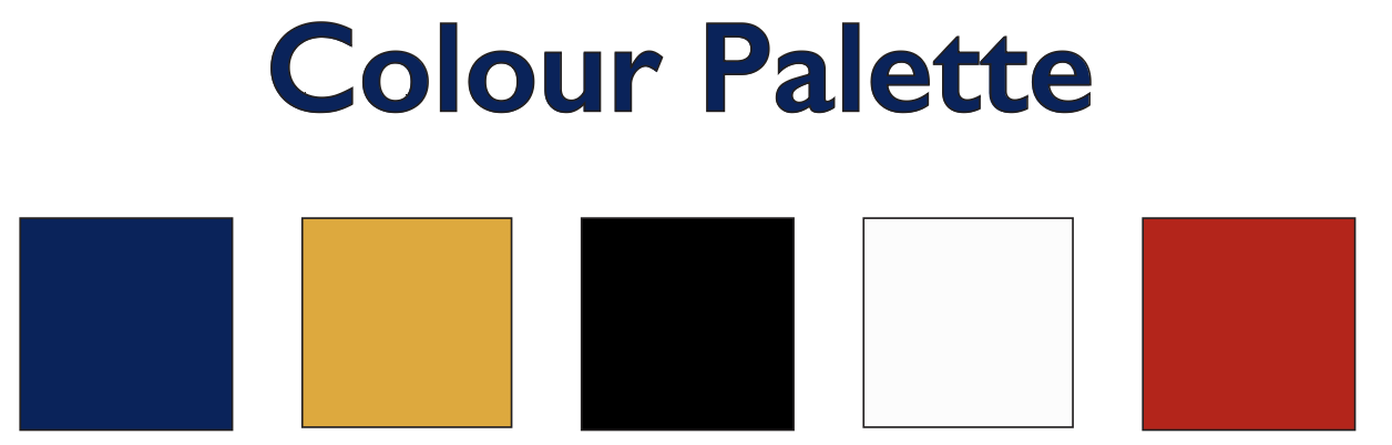
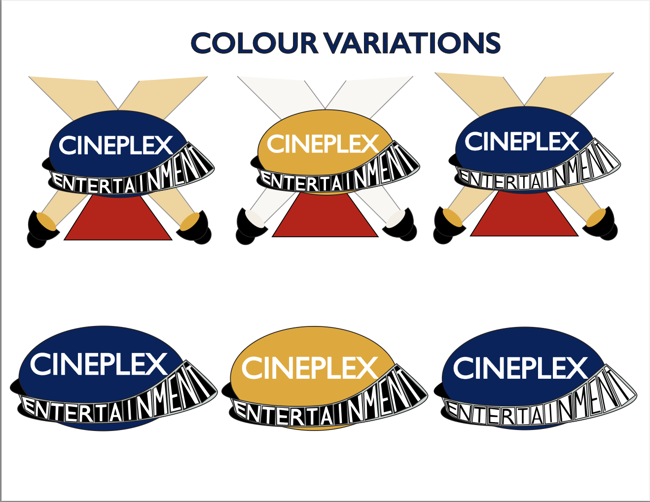
Colour Palette
The palette preserves Cineplex’s iconic colours while enhancing their cinematic impact. The colours are designed to feel bold, dramatic, and instantly recognizable.
Outcome
The Cineplex rebrand transforms the company from a minimal corporate identity into a bold, cinematic entertainment brand. The new system celebrates film culture, Hollywood glamour, and the emotional experience of going to the movies — reinforcing Cineplex as a destination, not just a theatre.
<<< See Previous Project
See Next Project >>>

Brand Strategy • Logo Design • Style Guide • Illustration
Cineplex Entertainment Rebrand — Brand Identity & Visual System
This project is a full brand reimagining of Cineplex Entertainment, Canada’s leading movie theatre and entertainment company. The goal of the redesign was to modernize Cineplex’s visual identity while reinforcing its core mission: delivering the magic of the movie-going experience through film, food, arcades, and immersive entertainment.
The rebrand introduces a bold new logo system, updated typography, refined colour palette, illustration guidelines, and a complete brand style guide to ensure consistency across all platforms.
Although Cineplex is one of Canada’s most recognizable entertainment brands, its existing identity felt visually minimal and disconnected from the emotional experience of cinema. The previous logo did not clearly communicate the company’s role in film, storytelling, and entertainment.
Brand Mascot — “Poppy”
As part of the rebrand, I introduced a new mascot named Poppy, a lovable popcorn character designed to add warmth, personality, and approachability to the Cineplex brand. Poppy represents the joy and excitement of the movie-going experience and helps position Cineplex as a family-friendly entertainment destination while still appealing to adult audiences.
Brand Strategy
The rebrand is built around the idea of Hollywood magic and red carpet glamour — turning every visit to Cineplex into a special event.
The visual direction draws from:
- Red carpet premieres
- Film reels and projectors
- Classic Hollywood iconography
- Theatre spotlights
- Cinematic staging
The goal was to make Cineplex feel less like a corporate brand and more like a destination for unforgettable experiences.
Cineplex logos throughout the years
The new Cineplex logo combines two powerful cinematic symbols:
Film reels — representing storytelling, cinema, and motion Red carpet — representing Hollywood glamour, premieres, and excitement
Logo Concept
The typography system balances familiarity with modern clarity. This combination maintains Cineplex’s existing typographic identity while refining it for a more contemporary look.
Typography System
Colour Palette
Outcome
The Cineplex rebrand transforms the company from a minimal corporate identity into a bold, cinematic entertainment brand. The new system celebrates film culture, Hollywood glamour, and the emotional experience of going to the movies — reinforcing Cineplex as a destination, not just a theatre.
<<< See Previous Project
See Next Project >>>
Brand Strategy • Logo Design • Style Guide • Illustration
Cineplex Entertainment Rebrand — Brand Identity & Visual System
This project is a full brand reimagining of Cineplex Entertainment, Canada’s leading movie theatre and entertainment company. The goal of the redesign was to modernize Cineplex’s visual identity while reinforcing its core mission: delivering the magic of the movie-going experience through film, food, arcades, and immersive entertainment.
The rebrand introduces a bold new logo system, updated typography, refined colour palette, illustration guidelines, and a complete brand style guide to ensure consistency across all platforms.
Although Cineplex is one of Canada’s most recognizable entertainment brands, its existing identity felt visually minimal and disconnected from the emotional experience of cinema. The previous logo did not clearly communicate the company’s role in film, storytelling, and entertainment.
Brand Mascot — “Poppy”
As part of the rebrand, I introduced a new mascot named Poppy, a lovable popcorn character designed to add warmth, personality, and approachability to the Cineplex brand. Poppy represents the joy and excitement of the movie-going experience and helps position Cineplex as a family-friendly entertainment destination while still appealing to adult audiences.
Brand Strategy
The rebrand is built around the idea of Hollywood magic and red carpet glamour — turning every visit to Cineplex into a special event.
The visual direction draws from:
- Red carpet premieres
- Film reels and projectors
- Classic Hollywood iconography
- Theatre spotlights
- Cinematic staging
The goal was to make Cineplex feel less like a corporate brand and more like a destination for unforgettable experiences.
Cineplex logos throughout the years
The new Cineplex logo combines two powerful cinematic symbols:
Film reels — representing storytelling, cinema, and motion Red carpet — representing Hollywood glamour, premieres, and excitement
Logo Concept
The typography system balances familiarity with modern clarity. This combination maintains Cineplex’s existing typographic identity while refining it for a more contemporary look.
Typography System
Colour Palette
The palette preserves Cineplex’s iconic colours while enhancing their cinematic impact. The colours are designed to feel bold, dramatic, and instantly recognizable.
Outcome
The Cineplex rebrand transforms the company from a minimal corporate identity into a bold, cinematic entertainment brand. The new system celebrates film culture, Hollywood glamour, and the emotional experience of going to the movies — reinforcing Cineplex as a destination, not just a theatre.
<<< See Previous Project
See Next Project >>>